Contrast - Review
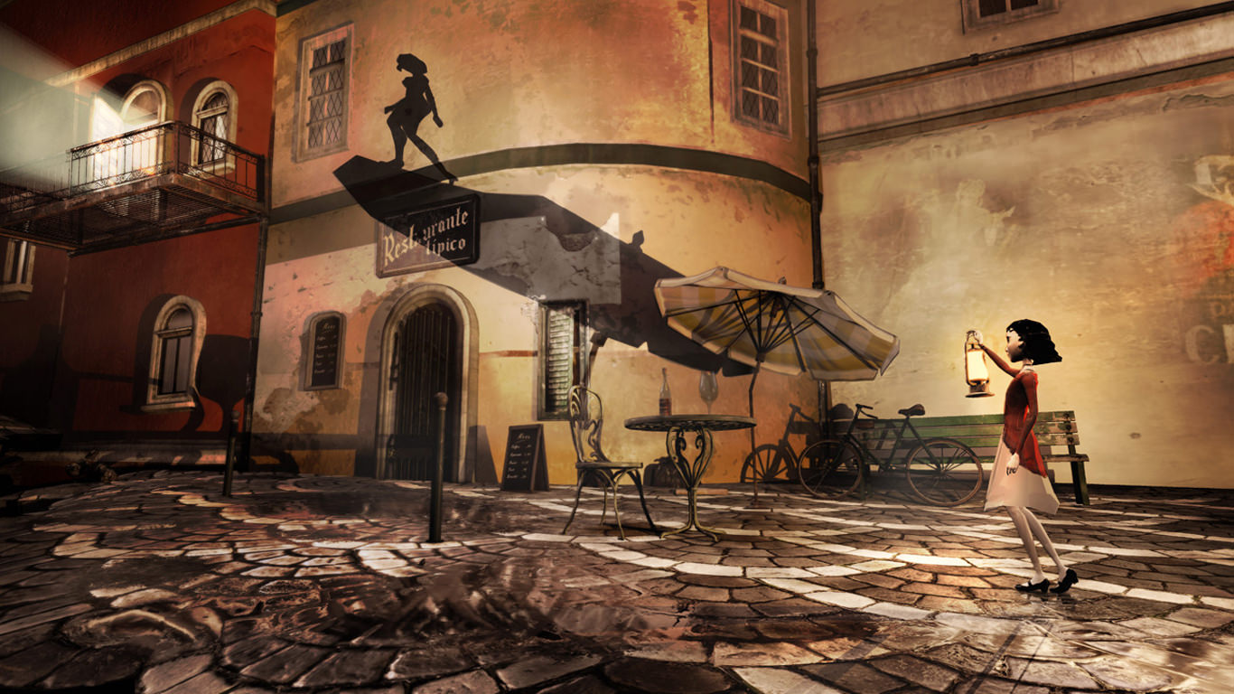
There are so many cool ideas floating around Contrast without a vessel to carry them. A puzzle platformer focused around shadows in a wondrous 1920's Paris, it showcases so much potential but fails to utilize it into something compelling. There's a sense developer Compulsion Games wanted to do a lot more with the concepts they introduce, but whether for time or budget reasons were forced to dial back and condense the experience, the results of which are often middling at best.
Contrast opens itself from the start with a desire to tell a dark, complicated story of a family split apart, with a husband in debt to some bad people, a mother who just wants the best for her child, and said child blissfully unaware of the trouble surrounding her as she just wants both her parents back. It's promising beginnings however are quickly cast aside for poorly written reunions, characters that seem to recognize the own stupidity of their actions yet follow them anyway, and a juxtaposition of science fiction elements that are all rushed and strung together as if the writer lost sight of the narrative halfway through and began grasping at straws to tie it all together.
EVERYTHING INTERESTING ABOUT CONTRAST IS LEFT UNEXPLORED
Everything interesting about Contrast's plot, from its world of shadow people, impossible environmental deformation, and female led cast are underutilized and painfully unexplored. I wanted to know more about what was happening but all I ever got were a handful of documents left lying around which sketch out a scenario so haphazard and contrived that the story is worse off for including them. Compulsion went through the trouble of making a great environment for your character to explore, but stretched it too thin while simultaneously having nothing to discover if you want to deviate from the set path. It's a lifeless, sterile city that seems so mysterious from afar but ultimately has nothing to show you as you make your way through its barren streets as quickly as possible.
Contrast's main mechanical hook of being able to jump into shadows is on paper really neat and creates an immense about of possibilities for puzzle designs and world navigation, but like everything in Contrast it's underdeveloped and poorly implemented. The places you're able to shadow jump (for lack of a better term) are fairly minimal, and you spend more of your time walking around in the real world lifting boxes and trying to control your finicky character. When Contrast works it's tedious and does a lousy job explaining its mechanics, opting for style over engaging gameplay which gets lost under the mountain of technical issues.
Your character moves awkwardly as if it's a puppet trying to break free of its strings. I was constantly clipping on edges while attempting to platform onto places I needed to, and even simply entering shadow mode failed more often than not, sending me careening to my death as an obnoxious restart sound bite played for the umpteenth time. Audio, graphical, and performance issues round out the family of technical incompetency that more than anything sell home the fact that Contrast needed more time in the oven.
Final Word
With how great the foundation of Contrast is, to see it come together in such a halfbaked manner is truly unfortunate. There's a very clear vision amid the mediocrity that the developer had much bigger plans than the neutered length allowed them to execute, which makes it so disappointing they weren't able to hold the game back from release until they could be better implemented. I hope this isn't the last I see of Compulsion, but I pray they're given a better time frame for future projects that allows them to capitalize on the potential they almost completely missed this time around.
Contrast is available on PC, Xbox One, Xbox 360, Playstation 4, and Playstation 3.


